見出しに共通の基本CSS
.box0, .box1, .box2, .box3, .box4{
font-size:20px;
font-weight:bold;
padding:15px;
margin:10px 0px;
line-height: 1;  /* 枠の高さを制御 */
}
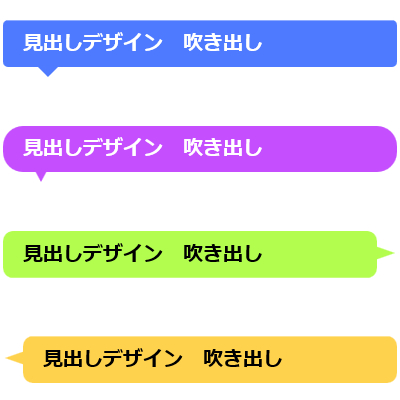
吹き出しの見出しを作る時は、文字の入った枠の下に同色の小さな三角を敷いた。
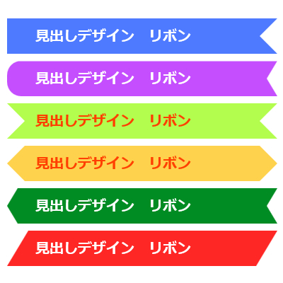
リボンの見出しを作る時は、
文字の入った枠の上に白い三角をのせて、その部分が切り取られているように見せる。
(三角の切り込み部分を白でなく透明で作る別の方法もある。
→ その場合、位置の指定の仕方が変わってくる。)
見出しデザイン リボン
border-right にのみ白を設定。(残りは透明)
.box1{
    position:relative;
    background-color: #4D7AFF;
    color: #fff;
}
.box1:before{
    content: '';
    position: absolute;
    display: block;
    width: 0;
    height: 0;
    top:0;
    right: 0;
    border-top: 25px solid transparent;
    border-right: 25px solid #fff;
    border-left: 25px solid transparent;
    border-bottom:25px solid transparent;
}
見出しデザイン リボン
□の形を×で区切った時の
上の赤の三角の部分 = border-top
右の黄の三角の部分 = border-right
下の緑三角の部分 = border-bottom
左の青の三角の部分 = border-left と考えて
色(または透明)、サイズ、位置を指定していく。
※枠の部分は position:relative 、疑似要素でくっつける部分は position: absolute; になっていること!
見出しデザイン リボン
枠の左角を20pxの角丸に、右の三角の形を縦長に(幅を狭く)してみた。
.box2{
    position:relative;
    background-color: #C54EFE;
    color: #fff;
    border-radius:20px 0px 0px 20px;
}
.box2:before{
    content: '';
    position: absolute;
    display: block;
    width: 0;
    height: 0;
    top:0;
    right: 0;
    border-top: 25px solid transparent;
    border-right: 15px solid #fff;
    border-left: 15px solid transparent;
    border-bottom:25px solid transparent;
}
見出しデザイン リボン
両サイドにリボンの切り込みを入れてみた。(beforeで右側、afterで左側を指定してみた)
.box3{
    position:relative;
    background-color: #B3FD4F;
    color: #FF3F00;
}
.box3:before{
    content: '';
    position: absolute;
    display: block;
    width: 0;
    height: 0;
	top:0;
    right: 0;
    border-top: 25px solid transparent;
    border-right: 25px solid #fff;
    border-left: 25px solid  transparent;
	border-bottom:25px solid transparent;
}
.box3:after{
    content: '';
    position: absolute;
    display: block;
    width: 0;
    height: 0;
	top:0;
    left: 0;
    border-top: 25px solid transparent;
    border-right: 25px solid transparent;
    border-left: 25px solid #fff;
	border-bottom:25px solid transparent;
}
この方法でリボンでない形もいろいろ作れる。
見出しデザイン リボン
見出しデザイン リボン
見出しデザイン リボン
見出しデザイン リボン
見出しデザイン リボン
見出しデザイン リボン