見出しに共通の基本CSS
.box0, .box1, .box2, .box3, .box4, .box5{
font-size:20px;
font-weight:bold;
padding:10px 20px;
margin:10px 0px;
}
疑似要素 :before, :after
最初はとても難しく考えていたけれど、簡単に色んなものをくっつけられて便利♪
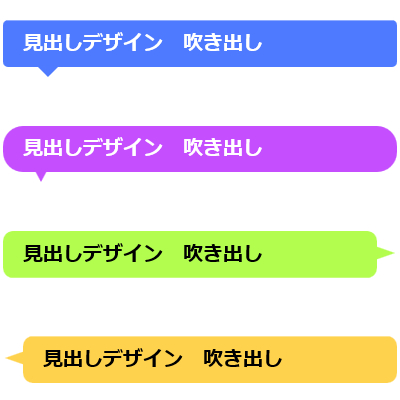
見出しの文字を入れた枠に
色、サイズ、位置など指定して三角をくっつければ吹き出しの見出しができる。
CSS疑似要素 :before, :after で作る見出しデザイン 吹き出し
□の形を×で区切った時の
上の赤の三角の部分 = border-top
右の黄の三角の部分 = border-right
下の緑三角の部分 = border-bottom
左の青の三角の部分 = border-left と考えて
色(または透明)、サイズ、位置を指定していく。
※枠の部分は position:relative 、疑似要素でくっつける部分は position: absolute; になっていること!
CSS疑似要素 :before, :after で作る見出しデザイン 吹き出し
枠の角丸5px。
左から30px、枠の下-10pxの位置に高さ15px幅15pxの下向き三角を配置。
.box1{
    position:relative;
    background-color: #4D7AFF;
    color: #fff;
    border-radius:5px;
}
.box1:before{
    content: '';
    position: absolute;
    display: block;
    width: 0;
    height: 0;
    left: 30px;
    bottom: -10px;
    border-top: 15px solid #4D7AFF;
    border-right: 15px solid transparent;
    border-left: 15px solid transparent;
}
CSS疑似要素 :before, :after で作る見出しデザイン 吹き出し
枠の角丸20px。
左から30px、枠の下-10pxの位置に高さ15px・幅8pxの下向き三角を配置。
.box2{
    position:relative;
    background-color: #C54EFE;
    color: #fff;
    border-radius:20px;
}
.box2:before{
    content: '';
    position: absolute;
    display: block;
    width: 0;
    height: 0;
    left: 30px;
    bottom: -10px;
    border-top: 15px solid #C54EFE;
    border-right: 8px solid transparent;
    border-left: 8px solid transparent;
}
CSS疑似要素 :before, :after で作る見出しデザイン 吹き出し
枠の角丸10px。吹き出しが端まで表示されるよう枠に margin-right:20px を指定。
右から-18px、枠の上から15pxの位置に高さ7px・幅20pxの右向き三角を配置。
.box3{
    position:relative;
    background-color: #B3FD4F;
    border-radius:10px;
    margin-right:20px;
}
.box3:before{
    content: '';
    position: absolute;
    display: block;
    width: 0;
    height: 0;
    right:-18px;
    top:15px;
    border-top: 7px solid transparent;
    border-bottom: 7px solid transparent;
    border-left: 20px solid  #B3FD4F;
}
吹き出し
インライン要素で使って。
※スマホなど幅が狭いと改行して表示がおかしくなるので短いテキストでのみ使用。
.box4{
    position:relative;
    background-color: #B3FD4F;
    color: #FF3F00f;
    border-radius:10px;
	display:inline;
}
.box4:before{
    content: '';
    position: absolute;
    display: block;
    width: 0;
    height: 0;
    right:-18px;
    top:15px;
    border-top: 7px solid transparent;
    border-bottom: 7px solid transparent;
    border-left: 20px solid  #B3FD4F;
}
吹き出し
枠の角丸10px。吹き出しが端まで表示されるよう枠に margin-left:20px を指定。
左から-18px、枠の上から15pxの位置に高さ7px・幅20pxの左向き三角を配置。
.box5{
    position:relative;
    background-color: #FFD24D;
    border-radius:10px;
    margin-left:20px;
}
.box5:before{
    content: '';
    position: absolute;
    display: block;
    width: 0;
    height: 0;
    left:-18px;
    top:15px;
    border-top: 7px solid transparent;
    border-bottom: 7px solid transparent;
    border-right: 20px solid  #FFD24D;

}
見出しデザイン 吹き出し
見出しデザイン 吹き出し
見出しデザイン 吹き出し
見出しデザイン 吹き出し
コメント
[…] CSSは参考になるCSSが沢山な下記のサイトを使っています。 広島 ホームページ制作|なないろウェブ […]